Making of OZO STATION
From a 1950s Gas Station to a Retro-Futuristic Mascot
The OZO Gas Station in Bellevue (RN10) inspired me to create the silhouette of a little mechanical gas attendant. In this logbook, I recount the history of the place, the architect Paul Lagneau, then I take you step-by-step from the first sketch to the final composition. The Fine Art print is available in the shop in various formats.
The Origin of the Project
It all started with a gas station unlike any other: the OZO Gas Station in Bellevue, an icon of National Road 10. Built in 1955–1956 by architect Paul Lagneau, this station, with its large concrete canopy and slender totem pole, symbolized the golden age of national roads, paid vacations, and family road trips in France. Modernism.

See the Wikipedia page for the OZO Bellevue Gas Station
OZO Bellevue Station on Facebook and Instagram
Now restored, it embodies a unique architectural heritage, blending industrial design with everyday poetry. It was upon rediscovering this place, steeped in history, that I felt the urge to bring it to life... differently.
Birth of OZO, the Little Robot
Observing the shapes of the building, its roof, its vertical spire, I saw something else: the silhouette of a character wearing a cap, holding a standard. The idea came naturally: what if the station became a little gas attendant robot, a guardian of a bygone era?
Thus was born OZO, the little robot, a creature part-architecture, part-machine, a nod to those gas attendants of yesteryear who disappeared with the advent of self-service.
And since its name inevitably evokes ozone, this robot also transformed into a symbol of protection and positive energy – a guardian of the atmosphere, in its own way.
Step 1 - Inspiration and First Sketches
Before drawing a single line, I put together a small mood board:
- archival photos of the OZO Bellevue station,
- typical 1950s cars,
- old Michelin advertisements,
- retro-futuristic mechanical robot designs,
- advertising pin-ups, garage tools, repair, etc.

These elements served as the basis for my first sketches.
In my quick thumbnails, the building transformed into a character: a small, sturdy, benevolent being, straddling his wheel, almost proud to hold his flag (time lapse on Instagram).
Step 2 - Drawing the Character

OZO takes shape: a gas pump mounted on a wheel equipped with a small moped-style engine. Its tubular arms end in gloved hands, one holding the totem pole, the other a gas nozzle from which a symbolic spurt sprays, watering the planet, with Bibendum getting a little bit. An assembly that is both mechanical and poetic, blending industrial memory and imagination.
Step 3 - The Overall Composition
To bring it to life, the station had to be placed back in its environment: the RN10, the mythical national road connecting Paris to Biarritz.
So I constructed a perspective where this road crosses the scene, a symbol of travel, speed, and freedom.

Quickly, "vroom," 1950s automobiles took their place in the composition: chrome silhouettes, full of movement and energy.
It's the setting of an era: holidays, gas stations, and the first great family getaways...
Step 4 - The Surprise Guest: Michelin's Bibendum
I've always had a soft spot for Bibendum, the Michelin mascot, a benevolent figure of the road and an imaginary companion for travelers, at a time when people still navigated by road maps that allowed for getting lost along the way.
In this scene, I placed him as a cosmic guardian: he holds the blue planet in his right hand, as a tribute to the road and to Earth.

This humorous nod adds a symbolic layer:
OZO and Bibendum - two icons linked to the road, one born of concrete, the other of rubber - together watch over our planet.
(NB: my version of Bibendum is stylized, conceived as a graphic homage and not a commercial reproduction.)
Step 5 - Colors and Atmosphere
For the coloring, I relied on the original OZO color scheme, dominated by red and white, then supported by shades of planet blue and touches of primary yellow to balance the whole and give it a little diesel kick.
Some gray levels recall the mechanical world or the station's concrete, while the overall palette evokes the 1950s, their signs, their Formica, and their bold tones.

A play of shadows and lights enriches the line art, bringing a subtle relief in 2D flat areas for a slightly three-dimensional effect.

Step 6 - Details and Texture
The illustration gradually enriches itself with a multitude of small garage elements: oil cans, spark plugs and pistons, double wrenches, screwdrivers, cross wrenches, fragments of bolts, grease stains, and multicolored exhaust fumes. A few splashes of gasoline and other oil drips complete this lively, aged, and authentic workshop atmosphere.

These details bring the material and memory of the place: one can almost smell the heated metal and the breath of an engine ready to go.
A Creation Between Past and Future
This project is a tribute to a bygone era, that of family gas stations, roads lined with luminous signs and promises of escape, but also a projection towards a more poetic and responsible future.
OZO the little robot is simultaneously:
- a metaphor for heritage coming alive,
- a symbol of transition, between gasoline and new energy,
- and a figure of benevolence, an imaginary guardian of our ozone layer.
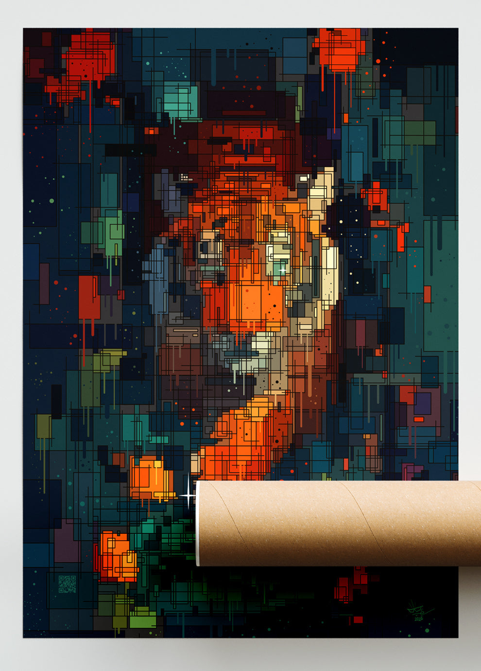
The Fine Art Print
The OZO Station print is available in the shop in various formats as a Fine Art poster.

To Conclude
This "making of" is not just the story of an illustration, but also an invitation to look differently at our ordinary landscapes, those forgotten architectures sleeping by the roadside. Because sometimes, all it takes is an unconventional gaze for a gas station to become a little robot full of soul.
Thank you for reading this, and welcome to the world of OZO